I need a book cover, and I need it by the end of the month. I need the agents and editors at the conference I’m attending to take one look at my cover, talk to me for five minutes, and think: “Wow. This girl really has her sh*t together. I want to help her succeed.”
When I began this quest for a cover last month, I tried doing what first came to mind: yellow, because yellow is happy. Some shapes. Maybe millennial pink? But nothing came out looking memorable, or even good.
Obviously first instinct wasn’t going that well– So I decided I wanted to do something a little bit homespun. First, because I don’t have the money to hire a cover designer, and second, because it communicates the personal nature of my book a bit better than something more refined.
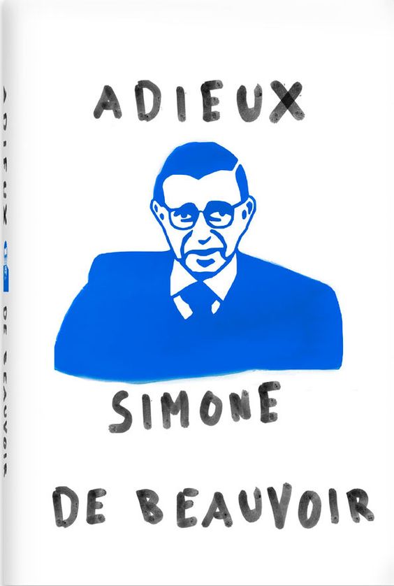
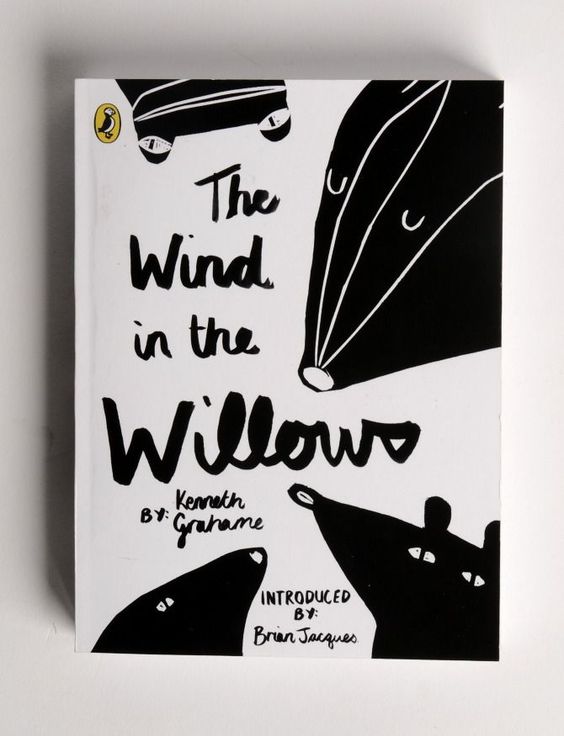
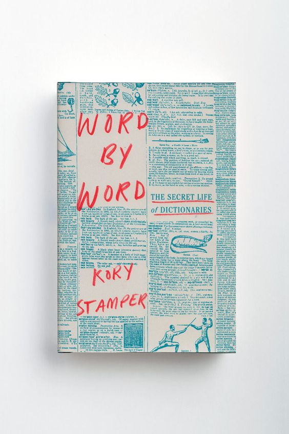
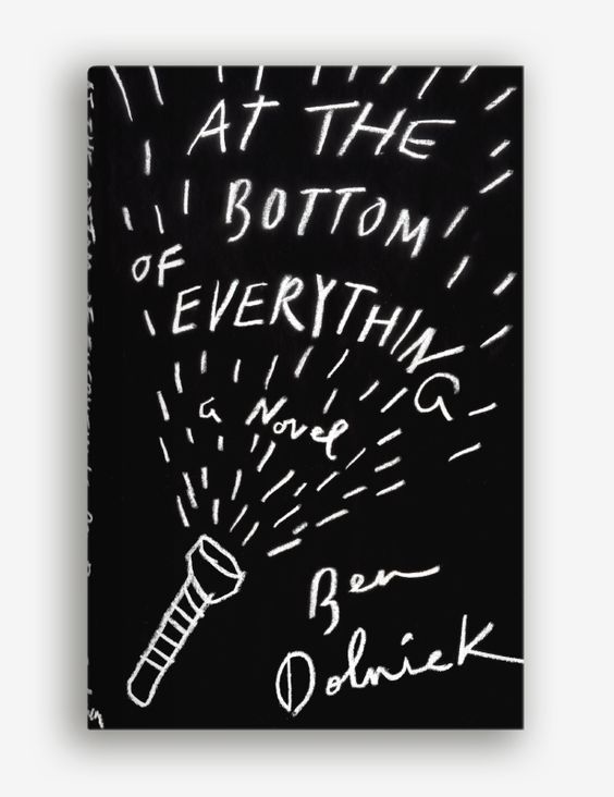
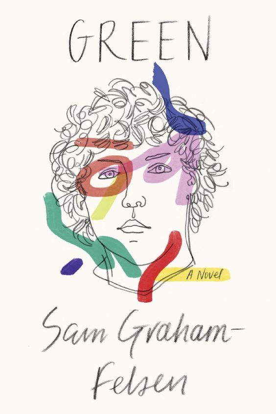
I began by accumulating lots of inspiration.
Then, in MS paint or on my phone or with pencil and paper, I tried my hand at a cover of my own. Mostly they were very ugly.
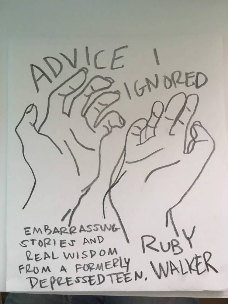
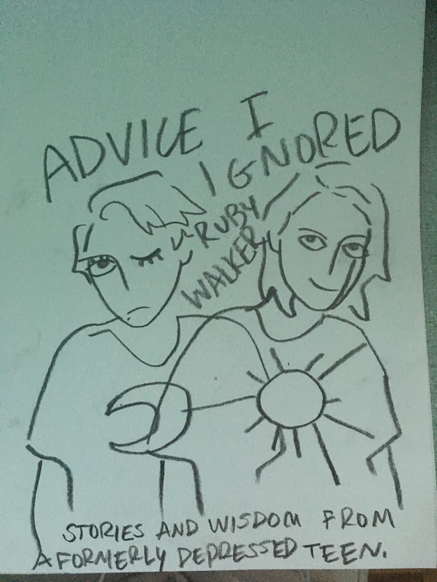
My latest attempt is this:
I may have to play around with different drawings, but I like the concept I have going now. I just need to make sure it’s pleasing from a design perspective, and I’ll be on my way.
UPDATE FROM OCTOBER 2019:
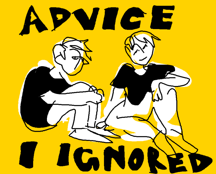
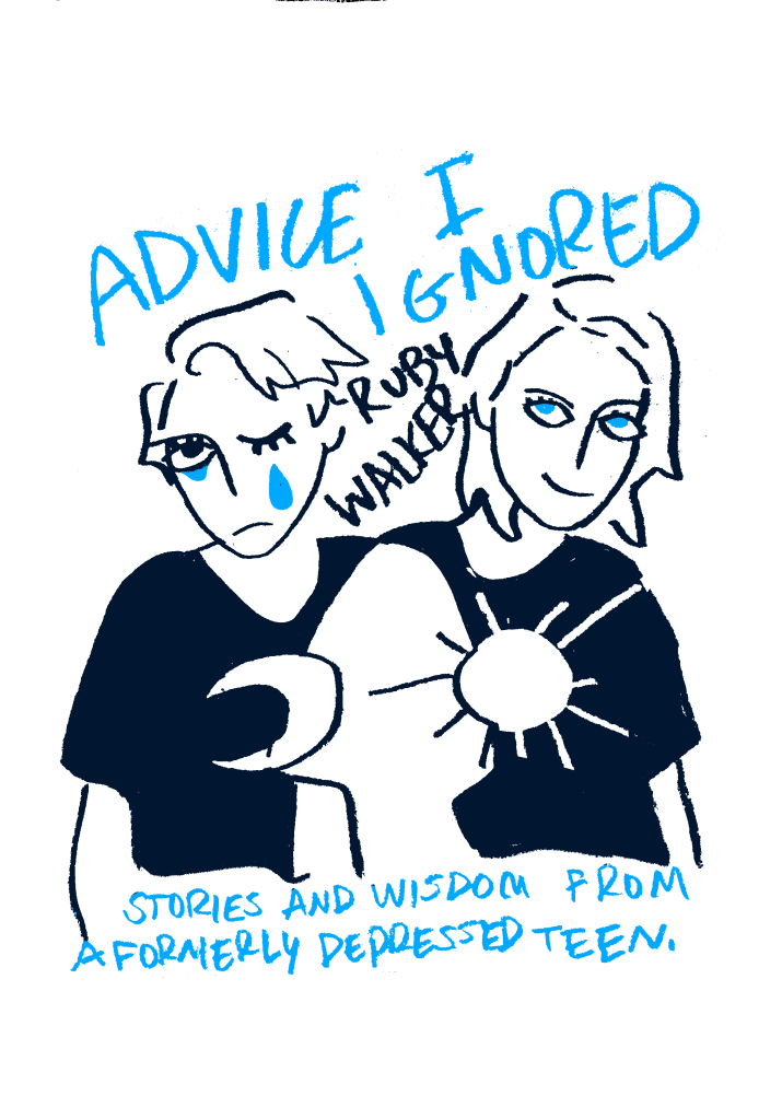
I took the advice of my stepdad and decided to make the image smaller and the text bigger – after all, what’s most important about my book cover is the title and subtitle.
I ended up taking inspiration from Kurt Vonnegut. I love the way his book covers combine simple doodles with large text.
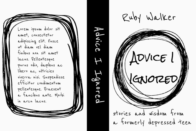
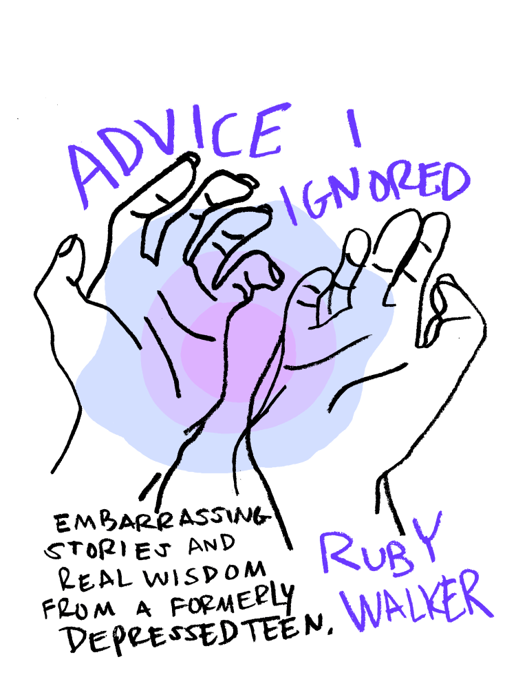
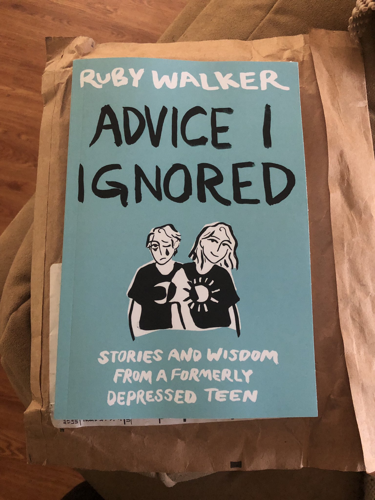
I liked the mockup a lot! And so began the process of actually putting the book cover together. I tried out a bunch of different colors, fonts, etc. but I eventually settled on a handwritten india-ink look to match the illustrations inside.
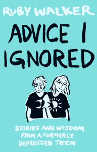
This is the final book cover. Looks pretty snazzy, doesn’t it!


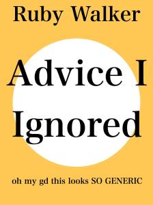
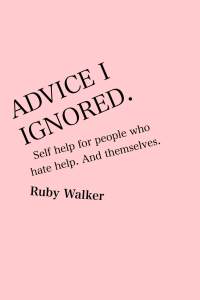
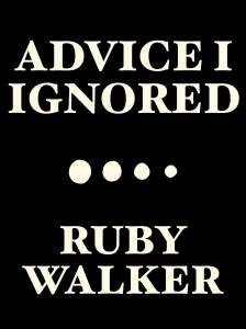
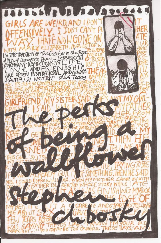
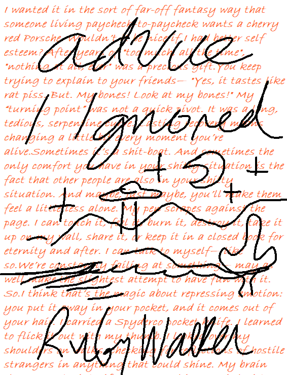
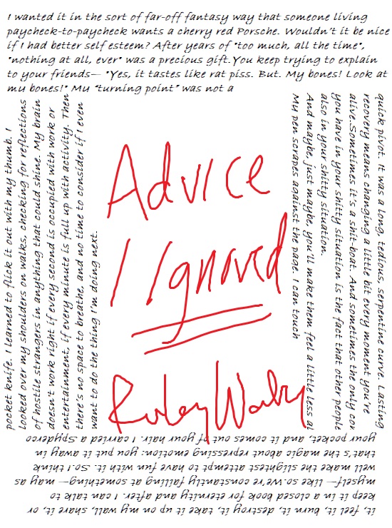

Ruby – Hello. I talked with you while we were at the convention this past weekend as we sat on the lobby sofa at the Hyatt and had our chat. I have just left visiting your website and found it interesting and in touch. But what do I know – I am just but a 60 year old still depressed individual. The book cover I like best is the one that “interacts with the edge of the book and does the Wallflower thing, but it’s not very… interesting.
I enjoyed the writing around the edge of the page it drew me in and made me want to read more.
Your talent is phenomenal and I can only assume that your writings are of the same caliber. I have a 14 year old granddaughter who I feel could benefit from exploring your thoughts.
Please stay in touch (we live so close) – I would enjoy hearing about your future endeavors.
Terry Freeman-Morris
512.696.3649
LikeLike
Wow– thank you Terry!
I only just now figured out how to use the wordpress commenting feature, so it’s been more than a year, (OOPS) but thank you. I am so close to having this book ready to publish and your kind words are helping my spirits a lot.
LikeLike